Nicole's Photography
Monday, December 13, 2010
Monday, December 6, 2010
Week 13 Portraits
I love these two portraits because they are such candid shots, but it was not easy to get these because the subjects were, initially, very conscious of the camera.
The first photograph, was taken at Sunday brunch on the last day of a weekend where I had my camera at the ready the entire time. I think my friend finally got comfortable enough (and I had my camera ready) so that I was finally able to get a good shot of her really smiling as she laughed at another friend's joke.
The second photo is of my daughter who, usually, likes to be front and center with a photograph. [All poses, no real expressions.] However, once again, I was just carrying the darn thing around in my hands most of the day and she finally forgot about it. [When I cropped this photo, I allowed some room to the left of her image (the direction in which she is running) giving her some space to look in to.]
Monday, November 15, 2010
Week 10 Assignment
Original
Edited
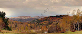
I used the Clone stamp tool in Photoshop to eliminate the grasses that were blocking the sky and hill. I also used the tool to erase the trailer, toys, etc at the bottom right hand side of the photo.
Watermarked
I played around with the text tool to create a watermark on this photo. Interesting idea to prevent use of the original photo.
Monday, November 8, 2010
Filter II Week 9
I used the WaterPaper, but then changed the it to filter Glass. This look has the feel of an impressionistic painting. [I also cropped and rotated the picture to make it more balanced and square.]
Filter I Week 9
The original photo is untouched (believe it or not). It is of my husband's pumpkin; he carved out the back and stuck in an orange bulb and funneled a fog machine into it as well. The result is a very scary pumpkin.
In the second photo I merely added the Ripple filter to the picture. The difference is subtle but, I think, scarier.
Dodge & Burn Week 9
I used the burn tool on the sky to darken it. I attempted to lighten the mountains by using the dodge tool, but found that just a few strokes resulted in white-ish blue streaks. I used the burn tool to darken this area back up. Overall, I like the sunset colors in the second, modified photo better than the first.
Monday, November 1, 2010
Photo Adjustments - Color & Light
[Note: I finally resolved my technical difficulties with Adobe Photoshop. The short story is my video card is insufficient for OpenGL Drawing so I had to disable this function (all I needed to do was un-check a box, who knew?). I have been having fun playing around in Photoshop this week and re-learning what I had learned on GIMP]

Original photograph

Photograph with Auto Exposure Correction applied. Hue and Saturation increased (slider moved to the right).

Photograph with Auto Exposure Correction applied. Hue decreased (slider moved to the left) and Saturation increased (slider moved to the right).
I really like the ease with which a picture can be manipulated to look completely different than the original. However, I did not see much difference when I attempted Color Cast Correction using Levels Color Channels. Did anyone else see much change when they 'played' with this feature?

Original photograph

Photograph with Auto Exposure Correction applied. Hue and Saturation increased (slider moved to the right).

Photograph with Auto Exposure Correction applied. Hue decreased (slider moved to the left) and Saturation increased (slider moved to the right).
I really like the ease with which a picture can be manipulated to look completely different than the original. However, I did not see much difference when I attempted Color Cast Correction using Levels Color Channels. Did anyone else see much change when they 'played' with this feature?
Subscribe to:
Comments (Atom)


